


So, I can’t seriously be the only one who has been doing “faux calligraphy” since I was a kid, can I?
I mean, it was totally unintentional- I used to just doodle in cursive writing all over all of my school supplies (sorry, Mom), and then go back with my pencil and add thicker parts to each letter. I always thought this was just how you added “shading” to your letters, to make it look prettier.
Turns out I was unintentionally teaching myself calligraphy at the same time- the parts I thought were “shading” were actually downstrokes!
Did you ever do this?! Tell me in the comments below and make me feel better!
Just here for the free worksheet? Skip to the bottom of this post!
(Not that I recommend that!)
If you’ve never heard of “faux calligraphy” before, it’s basically what you can do to create calligraphy when you don’t have a brush pen or other calligraphy tool.
It’s what I use aaaaallllll the time when I’m doing calligraphy on surfaces like windows, chalkboards, mirrors, mugs- you name it! Whenever you’re using a pen or tool that doesn’t allow you to change your pressures to create thick/thins, you’ll do faux calligraphy!
And, although you may have been doing this since you were a kid like me, there is actually some method to the madness- other than just adding “shading” like I thought!
Let’s look at how faux calligraphy actually works. (Feel free to skip ahead to the tutorial video if you like, or browse the recap below!)
The links below may be affiliate links where appropriate. This means that your purchase through these links may result in a few cents in payment to me, to support creating further resources like this one! That being said, I will never suggest supplies that I do not personally use and fully recommend.
You can do faux calligraphy two ways- with cursive writing (if you don’t know calligraphy basic strokes), or using your actual basic strokes (if you know them!).
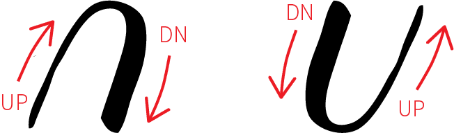
Either way, what you’re going to do while you write your word is focus on which direction your pen is moving. In calligraphy, anywhere you’re moving your pen in an upwards direction should be a thin line, and anywhere you’re moving your pen in a downwards direction should be a thick line.
Here’s a little diagram to recap the upstrokes & downstrokes rule:
Once you understand that rule, you can apply it to your faux calligraphy fairly easily. As you write your word, simply pay attention to which direction your pen is moving. Then, once you’ve drawn your letter, go back and thicken any lines where your pen was moving in a downwards direction- because downstrokes are thick, remember?!
Once you apply that rule to your entire word, you will have mimicked what your calligraphy would look like using a flexible tool, with heavy (thick) and light (thin) pressures on the pen!
Let’s look at the letter ‘a’ as an example, and recap the steps.

STEP 1: Draw your letter or word in calligraphy (or cursive if you don’t know calligraphy basic strokes!). Pay attention to where your pen was moving in a downwards direction.
STEP 2: Go back and draw the outline of a thicker area around any lines where your pen was moving in a downwards direction.
STEP 3: Colour in the thicker lines. Voilà!
Ready to give it a shot?
(Remember: you can use any writing tool- seriously! Even a pencil will work!)

The faux calligraphy worksheet is available in my Patreon! !
As a member of my Patreon, you’ll get access to this and the rest of my resource library which includes worksheets, traceables, templates, and more!


It is really very helpful !!
Like whenever you want to do calligraphy you don’t require any extra thing..Just a pen would do. I started calligraphy in the same way as yours 🙂 just unintentionally!
Thank you for this 🙂
On my gish, I always did this. I thought I was making shadow letters. Who knew?
thanks for sharing your videos and this sheets..
God bless you Becca
thank you sooooooooooooooooooooo much
I have. Not really jumped in so I will have to go v e an update, but I can tell you that you do beautiful work, and the videos are done so professionally, I enjoy your teaching
Hey, thanks a lot for this. It will help me advance in my calligraphy.
YES!!! I totally did faux calligraphy as a kid and didn’t realize it. I also thickened random flourishes on post it notes before I even knew what flourishes were! ? too funny!
I am still starting this calligraphy gig on my free time. (usually during the weekends) Thanks!
Did you ever do this?! Tell me in the comments below and make me feel better!
YES
Thank you very much for your work
I’m just starting (trying) to learn calligraphy. It’s fun but difficult than what it looks. I love to write in cursive but this is a whole new way. To write. Thanks for your videos. They have been helpful.
Thank you for sharing this work of yours. It will help me alot to learn calligraphy.
Great way to write!
Oh my God ! Literally I have been doing this all my life, yet there is a name to it. Thank you so much for sharing your knowledge and educating others by this. I am absolute in love with all your works and videos. Thanks again for the work sheets. I am so interested on working with those..
It’s really very helpful…Thnaks for sharing this video surely i’ll subscribe your channel love….thnak you so much!!!
Yes, I tried to make my paper textbook covers look more stylish. I would try and copy examples from the German text I found in dictionaries. It was a total mess, so I gave up.
I see that you can do, and really is a great job, congrats!!
I’m so happy I found your YouTube channel and subscribed 🙂 I’m ready to try my practice worksheet, but I’m excited about the course coming up in October!! I’m finally going to learn how to do lettering/calligraphy correctly! Thank you so much!
thank you for the amazing tools you have provided! i just recently starting journaling again and i loveee these for headers etc.
thank you again <3
Thank you for your video.you made it look so easy and fun!!
Thanks so much for sharing. I learnt copperplate at school in the 50’s but changed to cursive at TeachersCollege. Yes I definitely used this style to mimic the pen and ink effect. I am so enjoying getting back to it. Thank you again
Very useful for learning calligraphy.
Keep it up.
Thank you so much, the video was very helpful. Now IAnna just need to practice
Where did you get your pens from?
Another great tutorial, thanks Becca!
I’m new to this. My daughter and I have been journaling since February and adding calligraphy will be a nice touch. I found your blog today and wow am I excited.
I’m so excited to give this a try since I’ve been doing fake calligraphy for as long as I can remember. It’ll be nice to actually practice doing it now. Thanks so much for the tutorial!
One thing I totally love about your posts or YouTube videos is how you feel connected to your viewers. It feels like i personally know you. You also take extra efforts to know us by some polls, comments band that sort of thing. Thanks.
Can’t find the free worksheets. I keep being sent back to this where there are no downloads.
There’s a spot to enter your email! 🙂 The worksheet will be sent via email. 🙂
Thank you for your videos they are very helpful
You’re welcome!
Love this! Now I am really being creative.Thank you!!
Love your videos! I’m learning a lot!
Thank You for your help with making my lettering prettier. I was referred to your site by an
Emma Lefebvre video.
Literally the best worksheet ever!
Love love your videos! Just what I have been looking for… Thank you !
Thank you so much Becca! You have such great resources! I’m having so much fun getting started with you!
even I used to do it like that. but in cursive. now I know it
I did it doing middle and high school all the time.
I’d like the faux alphabet
It’s really helpful because I just realized I am doing it the wrong way HAHAHA thanks for the tutorial ?
Thank you. Question on letters where you write up to then go down, if at anytime your pen goes down would that be thicker? Lowercase t, a, d for example you go up on t then follow same line down, same for straight back on a and d.
I want the faux alphabet and any others that you might care to share. Thank you.
Great site!
Please email me the faux-calligraphy worksheer/tutorial.
Thank you!
Hi Becca! I watched your writing on faux pumpkins video again, since it’s been a couple years since I did it on a real pumpkin. This time, I bought 3 white faux pumpkins, and am writing my son’s significant other’s 3 kids’ names on them, for him to give them, when he goes over to go Trick or Treating with them, and to pass out candy afterward. I watched your writing on a pumpkin, as well as this one. Question: If I make a mistake with oil-based Sharpie, what is the solvent that will take a little mistake off? Mineral spirits? Or, just buy a new pumpkin? Thanks! I am the one who sends your every Friday dad joke to my grown son. He’s used them to relieve tension in meetings! He said they’ve been a lifesaver at least a couple times! Keep ‘em coming!
Thanks for showing us how to do faux Calligraphy!!
thank you!
Love your tips…I too have been doing faux calligraphy, without knowing it was that, for years! Thanks!
Tank you for thé work sheet
Hello. I am looking for the worksheet. I would like to learn to do faux calligraphy and then go on to the real thing. You make it look very easy. Your letters are lovely. I want to also learn some lettering for signs. Thank you for the instruction.